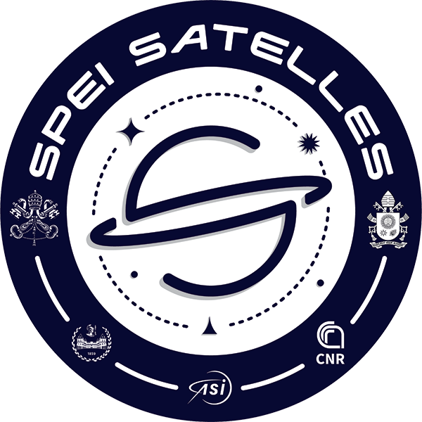

The logo of the mission
First of all, the logo recalls the initials of "Spei Satelles", the guardian of hope. The two "S" letters, arranged in a specular way, indicate the complementarity of "earth" (the lower semicircle) and "sky" (the upper semicircle), as well as marking the orbit of the satellite around our planet.
Another more external, dashed orbital trace composed of 59 lines as many as the beads of the rosary, combines three shapes:
 Cross
Cross
The cross (with curved sides almost to represent a star), the largest and most important element of the three, which indicates the presence of Christ the Savior and Lord of the Universe
 Star
Star
The 12-pointed star symbolizes the presence of the Virgin Mary crowned with 12 stars (Rev 12:1)
 Triangle
The smaller triangle, which in its shape recalls that of the cross, recalls the figure of the Holy Father as he climbs the steps of the churchyard of St. Peter's Square during the "Statio Orbis"
 Three dots
The three dots that appear over the outermost orbital track are a sign of the presence of the Trinity in the universe, as well as the triple announcement of the passion, death and resurrection in the synoptic gospels, a message that gives hope to humanity.
 The logo was created by the students and teachers of the IUSVE Salesian University Institute in Venice.